The Herbert Club is a (fictional) London members’ club with a modern approach to what used to be stuffy, exclusive institutions. Attracting members from the creative industries, the club is inclusive, inspiring and vibrant.
The venue is a former London theatre, so the thread of performance runs through the club, with a creative buzz felt across all the spaces.
This brief was part of The Brand Stylist’s Elevate programme for brand designers. While the client is fictional, the work is very much real.

Logo
We took an iconic London typeface and added a modern twist for the Club’s logo. This is P22 Underground, designed by Edward Johnston for the London Underground in 1916, with an outline to keep it fresh and enticing.

Typography
We wanted to use something with a flourish for signage, to keep the design close to the club’s theatrical roots. We chose Buena Park, which has just the right balance of quirkiness.

Collateral
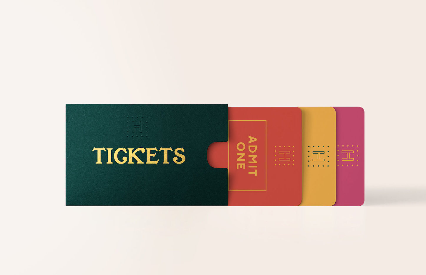
The Club’s event tickets also hark back to the building’s golden age, with embossed detail and a little ‘H’ icon inspired by the dressing room mirrors.

Colour palette
A colourful, intense palette to bring the Club’s vibrancy to life. The brand is all about creativity, so the colours were chosen to create a feeling of energy, warmth and passion.

This is phenomenal. It’s full of vibrancy, life and energy and you’ve really showed off the brand to its best strengths. Fab!Fiona Humberstone
The Brand Stylist

